
People notice things. I hope that is a generally accepted statement. Changes are easily noticed because, really, who doesn’t have a hard time accepting or adjusting to change?
Everyone in the Malvern community has had to become accustomed to substantial change this year: a new Head of School, new teaching styles, and new teachers. However, one major change that quickly dove under the radar (remember Linsanity?) is the the colors in Carney. This singular change continues to affect everyone in the building without people knowing.
There were significant reasons behind the change of color. Mr. Talbot made the ultimate decision for the change. According to him, this is just the first step of the great swan dive that Malvern is taking into the depths of 21st century education. “Desks in rows, students in alphabetical order, all eyes on the teacher at the front of the room, and ‘institutional’ colors to discourage an overabundance of excitement,” according to Mr. Talbot, were all designed by previous models of education. The 21st century classroom, by contrast, is designed around connection, collaboration, and creation. Everything is/will be different: layout, desks, whiteboards, and paints.
So why paint first? “That’s the easiest to do,” said Talbot. Simple as that.
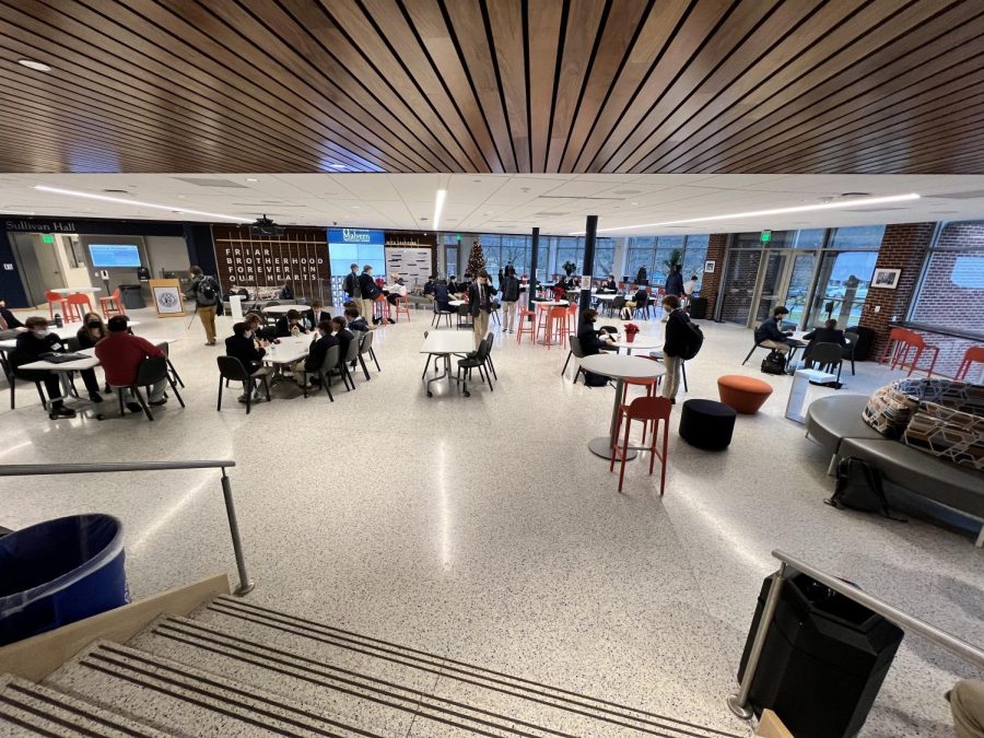
So people understand the movement towards the 21st century education, but what about the colors? How were the bright yellow and the blues inside the rooms chosen? According to Mr. Talbot, the colors are modifications of the ones that were already there. They were amped up a little. The yellow is “warm and energetic…and it reflects a lot of light to keep the hallways bright.” The blues represent the two-tone school colors that really exude Malvern.
The Malvern community seems to agree with the ideas behind the color change. Mr. Talbot has heard from “a couple of faculty” that the rooms look “crisper”. Kevin McGeary also seems to have adjusted well to the change: “It’s bright in the hallways, and the classrooms look like the horizon line at the beach, with the dark water and the light sky.”
Overall, this change has been a nice adjustment all. It’s a good way to ease into the bigger changes that are to come, including new desks, but we will just have to wait and see what 21st century education will bring us.